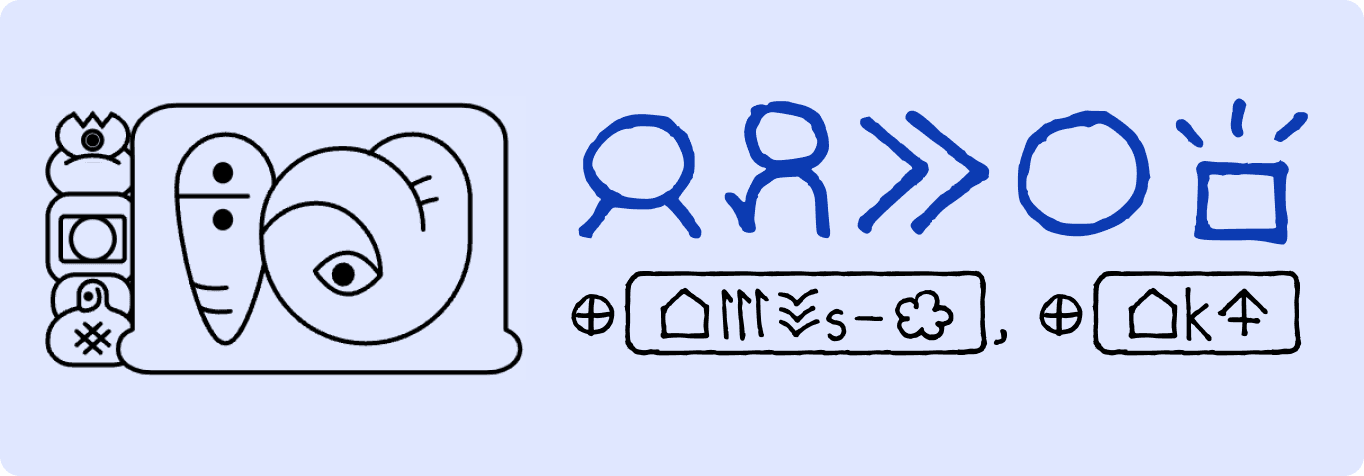
This weekend, I’m attending the Face/Interface HCI Conference at Stanford, where leading voices in typography and interface design will explore linguistic diversity in the digital age. https://face-interface.com/. I wanted to share some thoughts on logographic languages in digital spaces from experience studying toki pona.
Working on its digital typographical rules, here's what I learned:
I became interested in digital typography during my master's program at CCA, where I studied Form under Nathan Shedroff. Under his tutelage, I developed typographical rules for Toki Pona, a philosophically constructed language with a logographic writing system.
Toki Pona’s minimalistic language structure—with 120-word vocabulary and hieroglyphic-style scripts— was developed by Sonja Lang to simplify thoughts.
Simplicity of Thought = Simplicity of UI
Toki Pona emphasizes deliberate communication, echoing minimalist principles in interface design. Modern UX and digital design strives for users to understand the interface with the minimum of cognitive overload. As digital systems have evolved into standard patterns, it means that users have learned the language of design, for example, that "Search" is signified by a magnifying glass or that three dots or lines signify a menu or list.
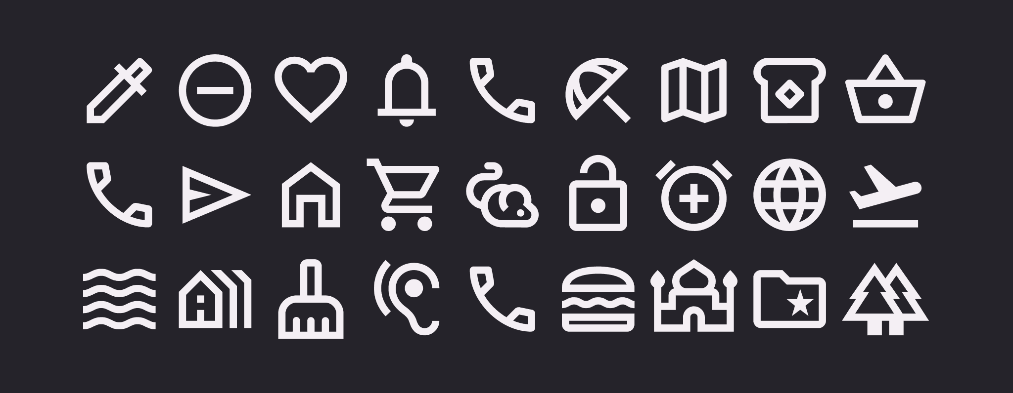
Screenshot: Courtesy of Material Design [https://m3.material.io/styles/icons/applying-icons]
Cultural Nuances in Logographs
Each logographic symbol conveys more than meaning; it's VIBES. Pictograms carry context and emotion. The use of sparkle emojis to depict AI is a great example of this. BTW, more reading about that here (fascinating stuff);
https://www.nngroup.com/articles/ai-sparkles-icon-problem/
https://qz.com/how-became-the-unofficial-ai-emoji-1851059332

Screenshot: Courtesy of Quartz
Formalizing Digital Communication
Without formal structures, logographic systems like emoji evolve organically, creating generational gaps in literacy. An emoji might mean different things to Gen Z and millennials. Meaning even varies from platform to platform. Check out this example of how different emojis are perceived differently across Android and iPhone: https://www.tiktok.com/@etymologynerd/video/7457331351214165290
Changing Digital Design for Logographs
I mocked up a Spotify interface using Toki Pona’s iconic script, translating concepts like search, libraries, and genres and assigning each music genre a unique icon. This exercise showed me the challenges involved with scaling icon libraries. The more nuance is needed, the more complex the notation is needed.
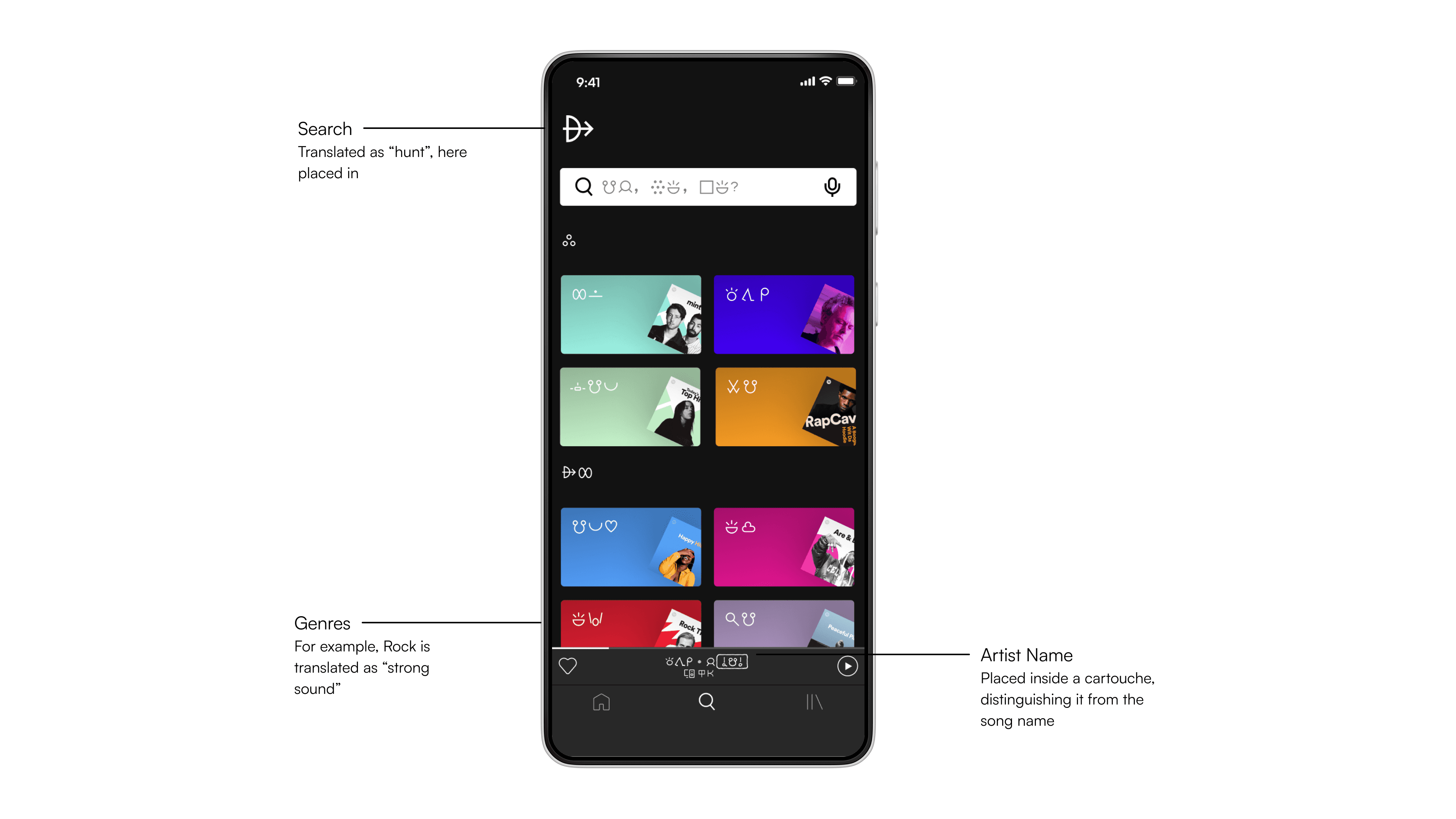
However since the point of toki pona is to think simply, it forced me to think of my translations simply. I used online translators to help me. For example, Rock music is translated to "Strong Sound" - but what makes Rock music any stronger than other genres? I wasn't sure. To me, this remains an open question about pictograms and emojis in general.
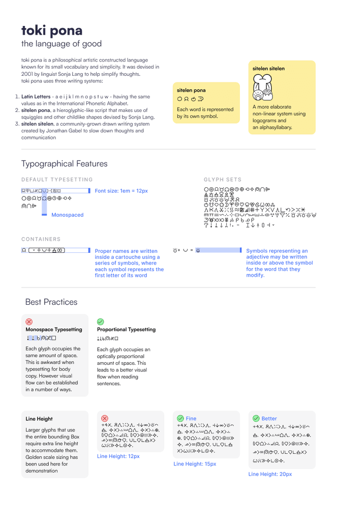
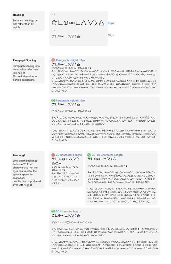
Doing this exercise, as well as applying constraints and context of typography gave me an understanding of how to establish some typographical rules, like spacing, hierarchy and word shape.
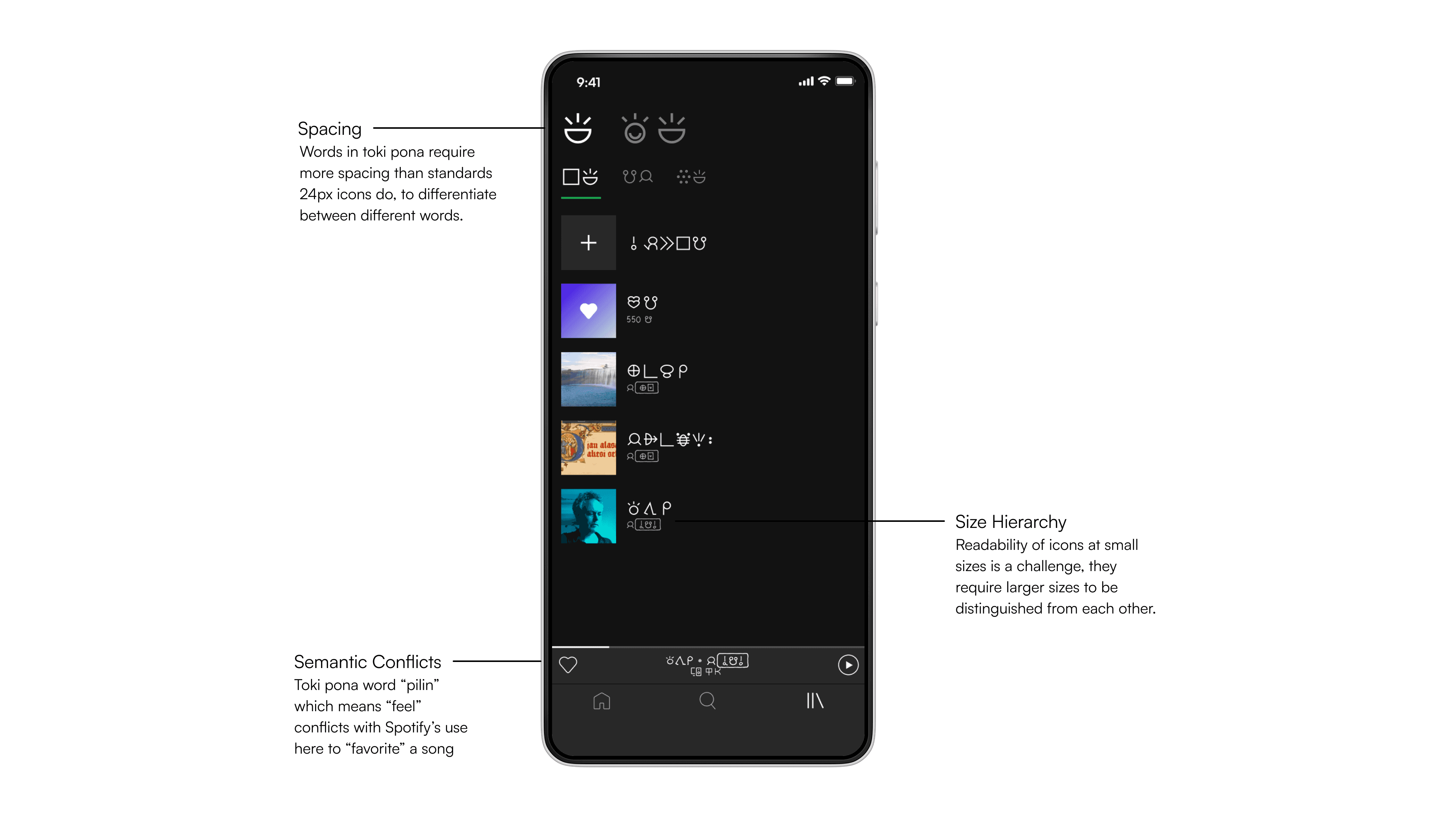
Toki Pona Typographical Rules:
Here's what I came up with, heavy inspiration from Mandarin chinese typography practises. Reference:
As digital typography evolves, we’re not just designing fonts—we’re shaping how ideas and emotions flow in a globally connected world. I've only just begun to dip my toe into these waters and I’m thrilled to learn from experts at the conference about the future of multilingual design systems, creating accessible type, and the interplay of technology and culture.
Bonus: For fun, I also typeset my own name in toki pona
Thanks to the toki pona subreddit for toki pona language resources [https://www.reddit.com/r/tokipona/]
