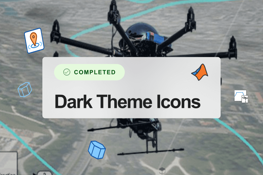
Designing a massive icon set is more than just getting to pixel perfection — it’s a logistical puzzle, a test of consistency, and, in the best possible scenario, a collaborative triumph. Each icon has size variants, alternative versions, and countless iteration! During my time at MathWorks I created cohesive sets of 175+ dark-mode compatible icons. I developed my design methods from my experience handling single icons and small sets and scaled it up to handle a large-scale projects where quality and meaning had to be preserved across dozens of products. Here’s how I made it happen.
Step 1: Set the Stage with Real-world References
With an icon project of any size, I start with inspiration and language from the real world. This is an opportunity for collaboration – the more diversity the better! I gathered my team and asked them to brainstorm keywords associated with each icon’s function. This was about meaning and association—icons need to feel intuitive, so every symbol needed to resonate with the user.
For example, Laser Scan Sensors have varied associations: "Lasers" "Lines" "Sensors waves" "Search" and even pop culture references like "Star Wars", etc. Everybody on the team, including developers, writers, customer facing engineers and project leads contributed their own references and images that reflected those keywords, ensuring we were all aligned on each icon’s “story” before pencil hit paper.

[Image Source]
Step 2: Sketching – Quick, Rough, and as Many as Possible
With a foundation of words and references, it was time to start sketching. Icons need options—lots of them. So I begin with rough sketches, simple outlines that left plenty of room for exploration. At this stage, I can gather feedback from my team quickly, evaluating different design directions.
Icons needed to be flexible enough to be reused for other applications while being specific enough to help with recognition. A system of base icons with badge modifiers is a good way to do that.

Step 3: Refining the Icons
Once we narrow down 2-3 promising options, I move to high-fidelity designs in Figma. At tis stage, real-world constraints come into play. An icon can look beautiful large, but its true test is in small sizes. Turn on "Pixel Preview" to see exactly how the icon will appear at a smaller scale. The natural limitations of size make certain design choices stand out. It became clear which versions held up clearly and which ones needed refinement. This saved time and made sure only the best designs moved forward.

Step 4: Iteration – Using Figma to Gather Feedback and Keep Track of updates
Here’s where the process can get overwhelming: feedback management. When you have dozens of reviewers, keeping track of revisions and the status of each icon is key. For this, Figma was a lifesaver. Each icon became a component, with variants for different sizes, and updates were easy to implement across the board. For a project like this, Figma’s component system streamlined the entire workflow, making it simple to handle scale without losing track of quality or feedback.
I maintained a master list of icons to be reviewed with the latest changes and kept every iteration of the icon sets in seperate Sections.

The Impact: Quality, Efficiency, and a Unified Icon Set
In the end, I produced multiple icon sets more than 175 icons in total, each consistent, meaningful, and pixel perfect. By building a structured, scalable workflow, I saved our team a week’s worth of effort, reduced duplication, and ensured that the icons were reusable across MathWorks’ expanding toolset. This wasn’t just about creating icons; it was about building a system where quality and productivity could coexist.
Taking on a massive icon project can seem daunting, but with the right balance of preparation, feedback, and tooling, you can bring clarity and efficiency to even the most intricate design challenges.