ROS Data Analyzer
I drove the end-to-end design process of this B2B desktop app, from conceptualizing workflows to launching the product, resulting in an efficient, no-code tool for users navigating complex robotics data.
Shipped
The Team:
1x UX Designer (Myself)
1x UX Researcher
1x Product Lead
3x Software developers
1x Technical Writer
1x Quality Engineer
Timeline:
5 weeks over a 6 month release cycle
Industry:
Robotics
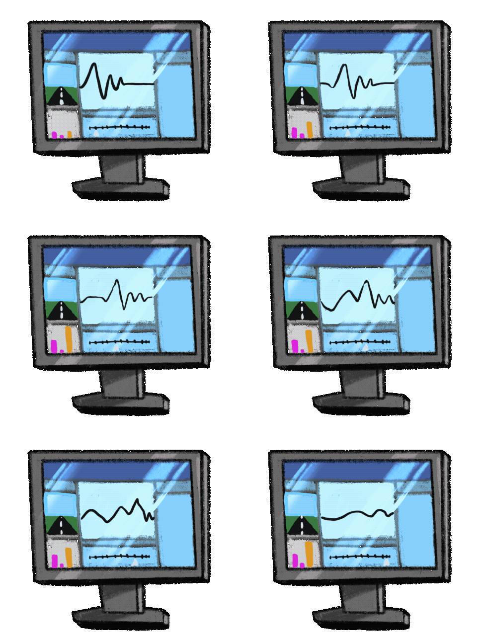
ROS Data Analyzer is a desktop app designed for robotics engineers to analyze sensor data.
The Problem
Robotics engineers must collect vast amounts of data when building and testing systems.
Analyzing this data requires specialized MATLAB programming knowledge and managing multiple custom visualizers, making the process time-consuming, tedious, and complex.
The Outcome
A no-code platform where users can achieve their analysis goals in a simplified, single workflow.

+50% Faster time-on-task
Major feedback from usability testing showed that the layout balanced discoverability while avoiding information overload.
In post-release feedback, Customers like ClearPath Robotics report that data analysis time has been cut by up to 50%.
"Rosbag Viewer enables us to easily manipulate and visualize high-dimensional data without importing libraries or doing the other legwork that would be required in C++"
ClearPath Robotics,
MathWorks Customer Stories
85% Task Completion Rate
Typical workflows are unstructured, which means that users first take the time to orient themselves in the environment before beginning data visualization.
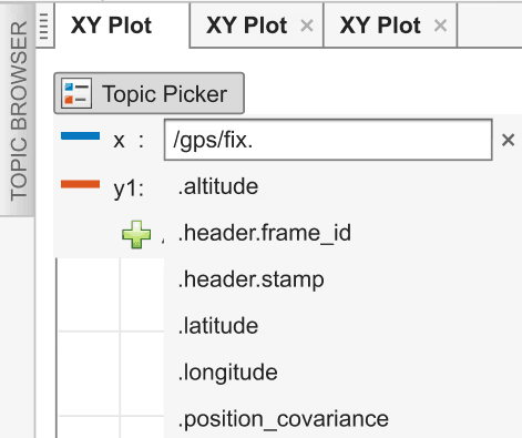
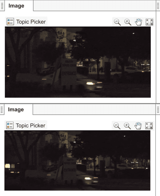
We designed the app so that users can compose their own layouts from a collection of configurable panels. This allows for flexible workspaces that change based on the goals of the engineer.
Due to intuitive layout, 6 out of 7 users were able to complete their tasks without asking for assistance or referring to documentation
0% Error Rate while identifying vizualizers
A comprehensive yet uncluttered layout that is carefully crafted to align with users' scientific mental models, providing the right information at the right time.
Usability testing showed that this created an intuitive understanding of complex data and reduced clutter without reducing capability.
All 7 users completed the task without any errors, thanks to the combination of icons and clear labels.

The app's primary users are robotics engineers who build and test robotics and autonomous vehicles.
These systems collect a large amount of data about their environments. Typically a combination of ultrasonic, radar, image, and Lidar sensors which they use to map the path ahead of them.
Engineers run and test robots
They collect data and import to MATLAB
They analyze data and modify the robot
Analyzing this robotics data is time-consuming, data-intensive, and complex.
It requires specialized MATLAB programming knowledge.
Users have to manage multiple custom visualizers.
Users write custom MATLAB code to open ROSbag files and analyze them
I planned cross-functional Design Workshops to kickstart collaborative ideation.
I planned a 6 hour workshop spread over 2 days with the full development team to kick-off the design process.
The workshop included:
Product leads
Researchers
Software Developers
Technical Writer
Quality assurance Engineer
Customer facing team-members
Design Workshop to brainstorm ideas for the app design – sketched in Balsamiq
We outlined ideas for future release versions, strategically phasing features to address the most critical needs first.
This reduced design effort for the next two releases, because a roadmap for future expansion was built into the design.
Brainstorming includes accomodating for further expansions and functionalities
Presenting the wireframes in expert critique bubbled up concerns about how the Rosbag app fits into the existing app eco-system.
By visualizing alternative user flows through wireframes, my team and I were able to clearly identify user flows and reprioritize features accordingly.
Wireframe showing how users write custom MATLAB code to open ROSbag files and analyze them
After building consensus with my team, we included two new functionalities in the release plan to ensure better workflow compatibility.
Involving with the team during design feedback helped us reach consensus on the priorities. The new design ensured better workflow compatibility across the system.
Wireframe showing changes to the app's functionality
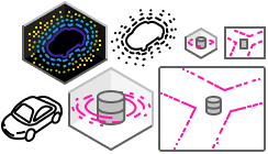
Once we finalized the design, I created custom icons to communicate functionality.
I matched the icons to real-world visualizations that users would see in-app to reduce cognitive load and improve recognizability.
Rough Sketches
I began with quick, hand-drawn concepts to explore multiple options. These sketches are tested with subject matter experts to ensure the icons are recognizable and meaningful to our target users.

Iteration
Through multiple rounds of refinement, I hone each icon to its clearest, most representative form. This process ensures that each icon effectively communicates its intended concept.

Pixel Perfect
I create precise SVG files using standard spacing and layout guidelines and make sure the colors used meet accessibility benchmarks to make sure icons can be easily reused across various applications.
Final Set of Icons
The final icon set delivers a cohesive, versatile solution that meets both design standards and user expectations based on the actual data visualizations, ready for integration into the product ecosystem.
I worked with a UX Researcher to usability test the app with robotics engineers.
I created hi-fidelity prototypes for usability testing the app. The results highlighted strong alignment between the app’s design and users' mental models.
85% Task Completion Rate due to intuitive layout
6 out of 7 users were able to complete the task without asking for assistance or referring to documentation.
0% Error Rate while identifying vizualizers
All 7 users completed the task without any errors, thanks to the combination of icons and clear labels.
50% reduction in time-on-task showed in post-release feedback
Customers like ClearPath Robotics report that data analysis time has been cut by up to 50%.
The best part of the experience was building strong collaborative relationships with my cross-functional team.
For the project to succeed, I learnt to value and include my whole team.
Preserve discarded ideas
Good ideas emerged during brainstorming but didn't make the final cut. As a team, documenting all ideas, even those not immediately used went a long way towards keeping the workshop atmosphere healthy. This practice also ensured valuable concepts weren't lost and could be revisited for future iterations.
Communicate early, communicate often
I discovered that contribution from the team was the key to adoption. Not only did my designs improve dramatically when I actively incorporated my teammates' feedback, it made them feel invested in the process. During meetings, I made a point to highlight how their input shaped our designs. I've come to see my role not as a solo designer, but as a facilitator of our team's ideas.


