RoadRunner Design System
I lead efforts to build a design system that addressed accessibility and discoverability issues while making internal development processes more efficient.
Shipped 2023
Team:
1 x UX Designer (myself)
1 x Project Lead
2 x Software Engineers
1 x Technical Writer
Timeline:
8 weeks over
2 Development cycles
Industry:
Automotive
RoadRunner is a 3D interactive editor used by engineers to design and simulate road environments.
RoadRunner Simulation Environment
Autonomous Vehicles Engineer
RoadRunner is primarily used by Autonomous Vehicles Engineers working at major automotive manufacturers like BMW, Ford or Toyota.
They primarily deal with map-based environments to create test plans for many kinds of autonomous test vehicles; testing for perception, prediction, motion planning and more.
Their primary goal is to create, test, and refine real-world driving scenarios to ensure self-driving cars operate safely in all conditions.
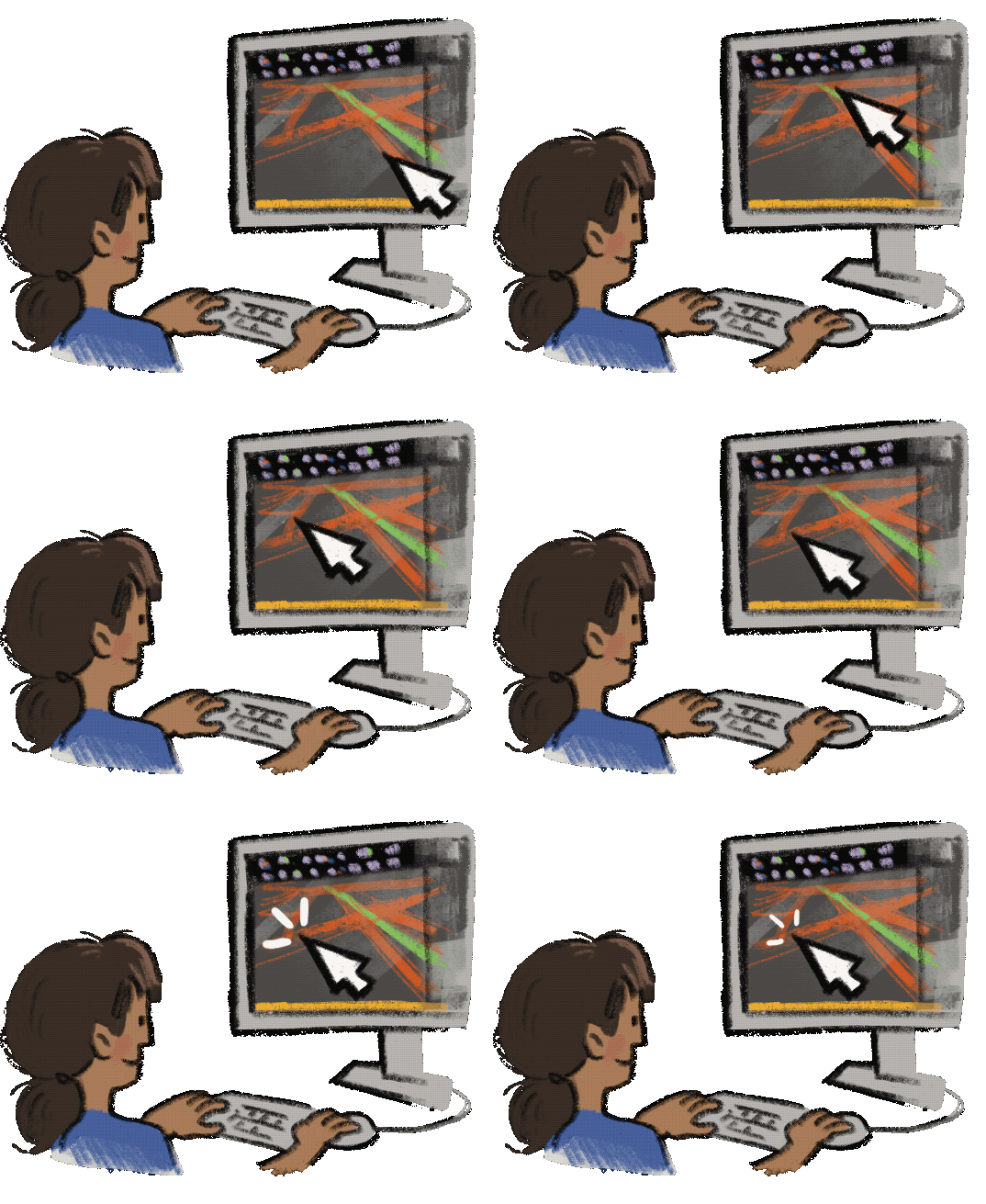
In their workspace, they work with a suite of simulation tools, a 3D canvas, and configurable widgets to build accurate road environments, model traffic flow, and troubleshoot complex edge cases. A typical workflow would have the following steps:
Choose a Build Tool
Choose from a suite of creative tools, like Lane tools, Junction tools or Prop tools to create lanes, junctions or props like traffic signals or road signs.
Create a road network
Click and Drag on the 3D canvas to create a scene. Draw roads from point-to-point, add lanes, or adjust road widths.
Configure the scene
Make precise changes to the road like specifying driving directions, changing the road materials (like concrete vs. brick) or typing in precise measurements.
Demo of the Tool Bars and Widgets (Current version)
67% improvement in WCAG 2.2 AA Compliance
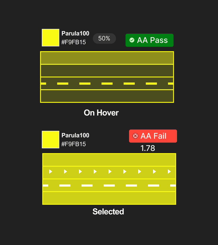
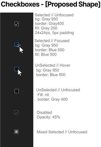
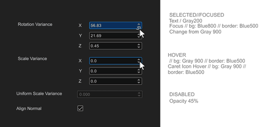
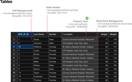
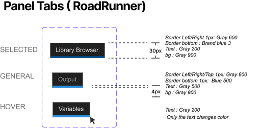
A major issue that was tackled was the readability of elements like text fields and buttons as well as other widgets in the Control Panel.
For example, the text and labels were difficult to read in the selected and focused states. 67% of the colors used failed WCAG 2.2 AA Standards. To fix this, I applied dark mode accessibility best practices throughout the UI to enhance readability at all states.
Before and After the Redesign of the Tool Bars and Widgets
30% increase in task completion with clear information hierarchy
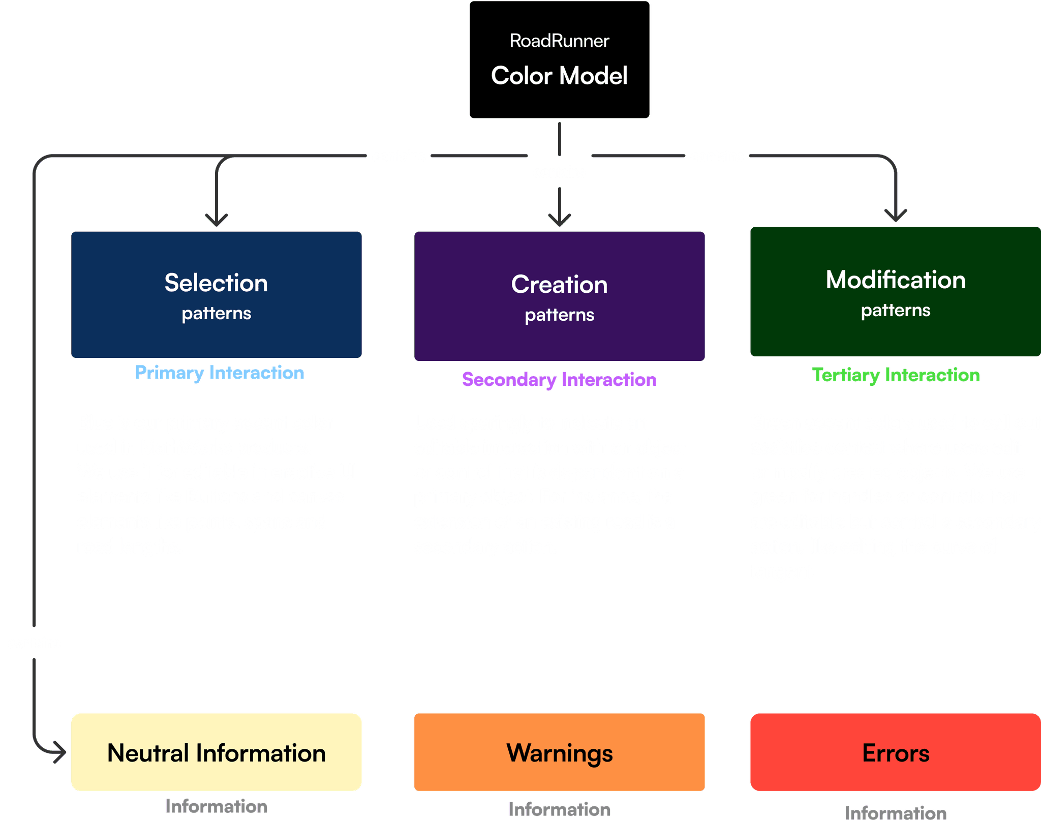
For the 3D Canvas, I created an atomic design system that modeled user's interactions in the 3D Canvas. There were three main types of interaction controls, and three ways to control them.
Before:
In usability testing, new users struggled to learn interaction patterns, relying on help text that was difficult to access in the workspace.
After:
Users reported that the tools behaved more intuitively since they better matched their mental models from other tools in their repertoire. This led to better information distinguishability leading to a 30% improvement in task completion and significantly enhancing user comprehension and focus during usability testing.
Atoms = Points
Defined as individual route points, serving as the fundamental building blocks of the system.
Molecules = Spans
Road spans created by connecting multiple route points, forming functional units.
Organisms = Routes
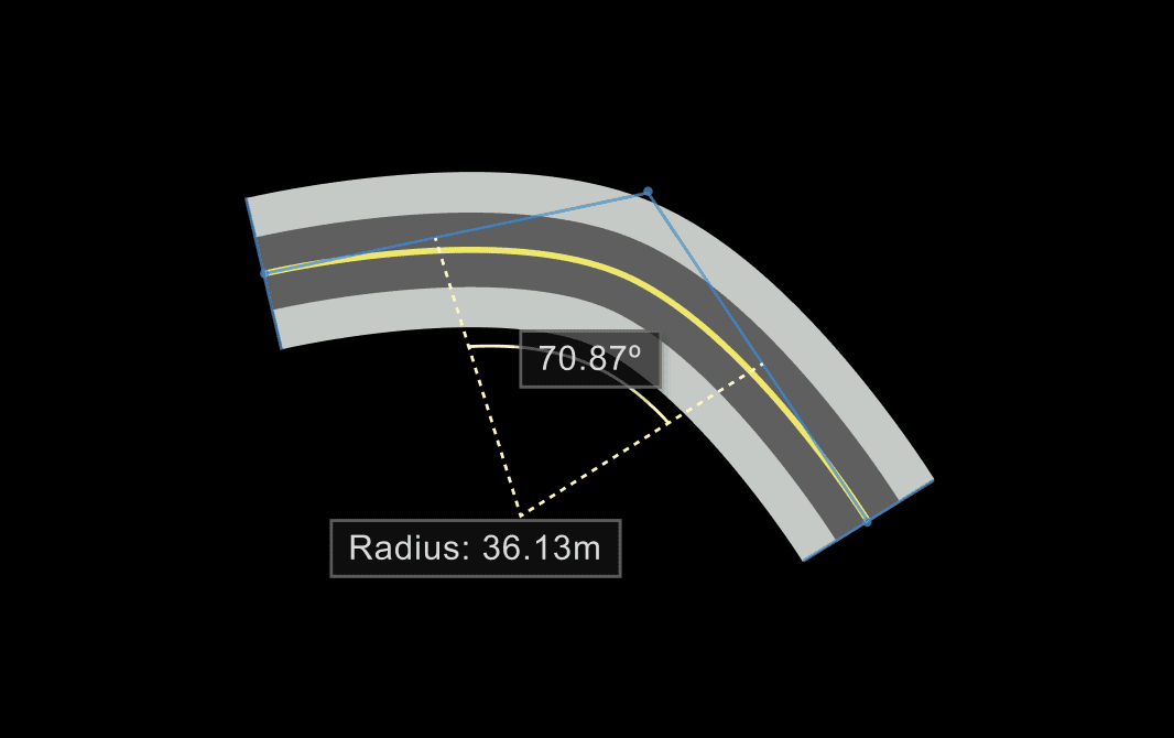
Complete routes, composed of road points, spans and curves, offering a full structure for road mapping.
Inconsistent and unorganized interface
As a newly acquired product, RoadRunner lacked alignment with the MathWorks ecosystem, leading to inconsistencies in UI and a lack of documentation on the back-end for how the interface behaved. We therefore had the following goals for the product's architecture:
Goal: Boost product integration
Seamless integration between RoadRunner and the wider toolbox offerings to bring new customers over to RoadRunner and vice versa.
Goal: Reduce Technical Debt
Develop a comprehensive system for engineers and designers to save effort. For example, there was no consistent logic or documentation around key features—like the implementation of the undo button, which was applied differently across tools.
Lack of intuitiveness and accessibility
New users struggled to navigate the tool, they reported that the use of colors was unintuitive, the text was difficult to read, and key functionality was hard to discover due to poor information architecture.
Goal: Simplify and Improve Usability
Standardize unconventional design patterns and provide more clarity of information so that new users can more easily learn how to use RoadRunner.
Size and scope of the project
Over 55 tools with inconsistent behavior makes it difficult to apply uniform patterns. The visual design had to balance standardization and flexibility so that new users can understand and adapt to each tool.
RoadRunner Toolbar with 55 tools
Mapping the product’s features helped to keep track of all the components
Managing scope also influenced my approach to research and design; I needed a clear starting point and a method to keep my research organized.
I collaborated with product leads to map the product’s features and prioritize changes so that users wouldn’t experience abrupt shifts in functionality.
RoadRunner users are engineers who typically follow unstructured non-linear workflows with broad goals. We began with qualitative methods to gather rough areas to find broad areas exactly where users may face difficulty.
We quickly discovered that this couldn't cover all product use cases or provide detailed insights into user goals tool-by-tool.
Customer-Support Tickets
Mined data from technical support tickets, especially cases where users were unable to discover functionality
Interviews with Sales
Interviewed Customer-Facing Engineers who meet customers on a regular basis
Usability testing
Conducted internal usability tests with engineers, new-Hires, and interns
Initially, I assumed I would need to conduct a full design audit, but I quickly hit a roadblock: the project’s huge scope.
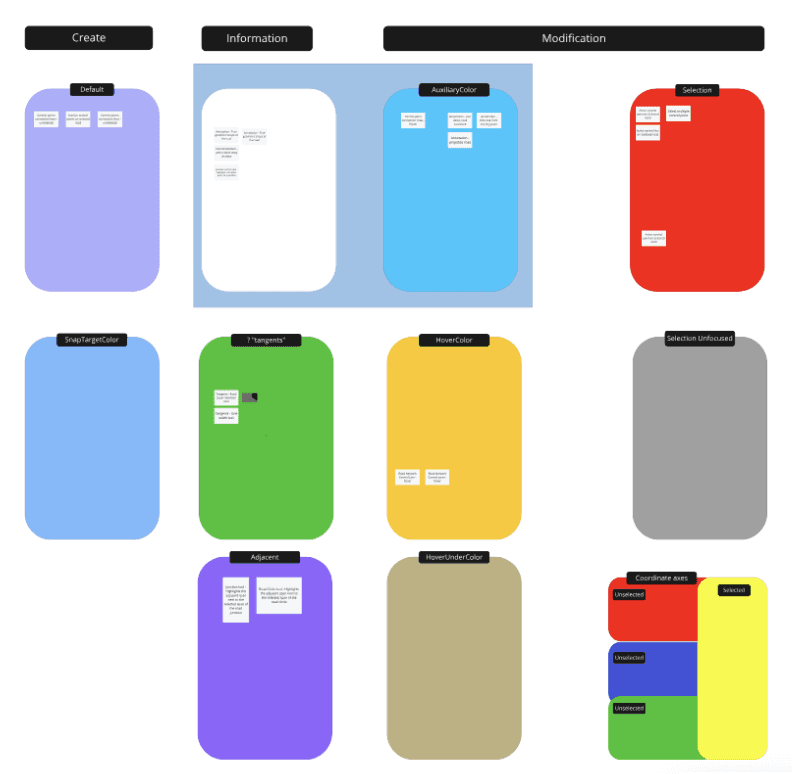
My plan at the start was to document each inconsistency in color use across all 55 tools in Miro. This turned out to be a misstep because:
I attempted the audit solo, when expert knowledge was needed to understand each tool.
The interactions I documented where too detailed, when the solution needed a high-level view
It was painstakingly slow
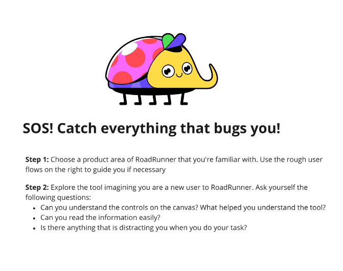
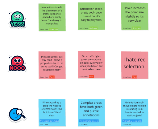
I pivoted to a "Bug-Bash" approach so that my team could help identify the most pressing usability issues.
I needed to pivot and fast, because I was running out of time in which I could finish the research and get started on ideation and prototyping.
Doing it in a bash meant that everyone from interns to experts added their learned wisdom to my research, making the experience feel like a high-energy hackathon.
I went from solo struggle to team triumph and leadership buy-in.
Since everyone on the team was involved with bug-finding it helped get buy-in from leadership on the extent of the problem and work needed to address these pains.
It also allowed for a breadth and depth of research across all the tools that I never would have achieved if I had worked on it alone.
Lesson learned!
Tasks based on users’ typical workflows
For the bug bash, I designed tasks based on users’ typical workflows. This created a logical mental model around common interaction patterns like building, selecting, and modifying roads.
I worked with a researcher to conduct contextual Inquiry with 2-3 participants to discover user workflows.
We learnt that users take looping, unstructured workflows to achieve the result the want, like building a road network. The iteratively create, adjust and modify as go. This makes it challenging to create a generalized workflow so I mapped out each workflow separately by goal.
Example user flow, documenting mouse-clicks and control-points of curve-editing type tools
Support users' goals at each step
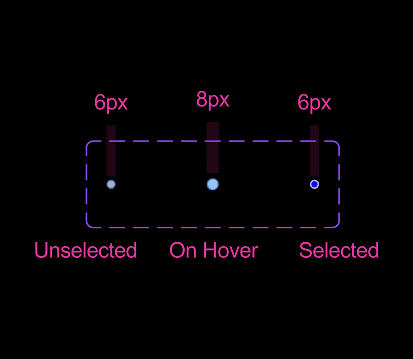
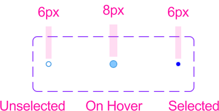
I tailored the visual design to support users' goals at each stage, using size, opacity, and shape—not just color—to differentiate elements.
Below is an example these design decisions in action. These acted as the justifying principle behind the color use.
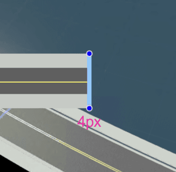
On Hover
User Goal:
User inspects the road span by hovering
User Need:
Clearly identify a modifiable road
Design Decision:
Visibility: Target is at full-opacity against background
Feedback: Target size increases in response
Clarity: Increase in target size so that its clear which span has been selected.
User Goal:
When users selects a road to be modified, they need to have an overview of the whole scene to adjust the span location.
User Need:
Distinguish between selected and unselected points
Design Decision:
Visibility: The line should not obscure the scene, but it should be clear that it is active
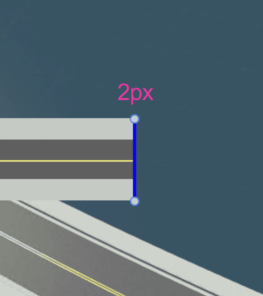
Feedback: Target size decreases to default size, border and fill invert
Clarity: Decrease in target size so that the whole scene is clear
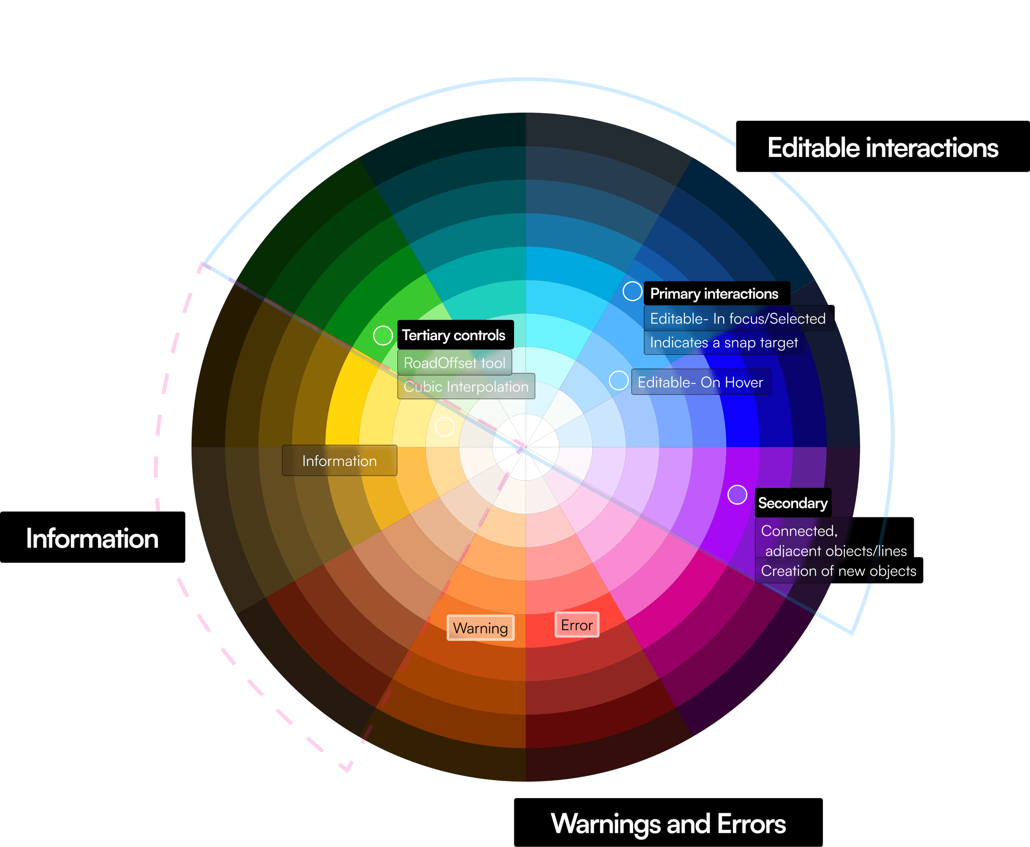
Aligned with MathWorks’ brand colors
Blue, used for primary interactions like selection was used because of clear associations to established interaction patterns in MathWorks' other platforms.
Purple and Green were new additions to the visual vocabulary, and chosen to depict lesser-used interaction patterns.
This left Red, Orange and Yellow to be reserved for warning and error colors, matching real-world applications of there colors.
Throughout the process, I prototyped and documented my work simultaneously.
This allowed me to review progress with accessibility experts, developers, and other designers across the organization who would use these components.
Prototyping in Figma
I started prototyping the components in Figma. This worked well for standard components like buttons, checkboxes, and text, but failed when it came to complex interactions like creating or selecting road spans.
Testing contrast ratios in Figma
I started looking for alternatives to Figma to prototype these interactions, but fell short.
In the meantime, I leveraged Figma plugins like Stark to test for contrast ratios, ensuring we met WCAG 2.2 AA Accessibility standards for graphics (3:1 Ratio). While this helped with the visual aspects, the interactive elements remained a challenge.
Creating a Sandbox for testing reduced Figma prototyping time by an entire week.
I needed a more flexible tool that would help me prototype rapidly, so I reached out to our development team for help.
They helped me create a sandbox environment that allowed me to directly test complex interactions in real-time though simple CSS style changes, using a mirror of the actual codebase of Roadrunner.
This helped me:
Accurately simulate complex road span interactions with the exact colors and sizes used
Test and refine user flows in a realistic environment with grass, trees, and vehicles.
Our new approach was much faster and more importantly, it provided a more accurate representation of the final product, allowing for better design decisions and smoother implementation.
I documented the reasoning behind each design choice, created reusable components and styles in Figma.
I iteratively improved the documentation based on developer feedback. It includes reusable Figma components organized by user goals, with mock-ups demonstrating how the components behave and why.
In the final weeks of the project, I opened up the RoadRunner component library to other designers to pilot so that any bugs or implementation issues could be sorted out.
The redesign improved consistency across the different tools while providing more clarity of information.
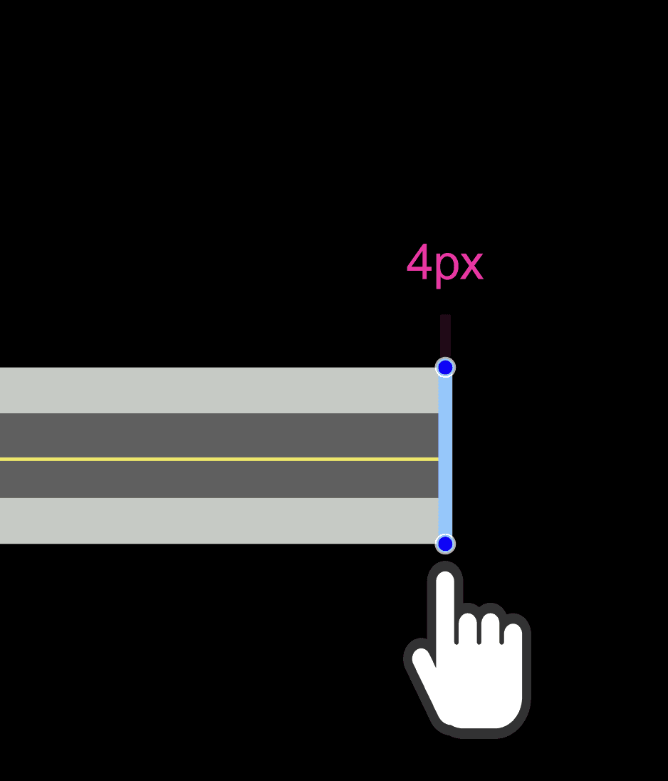
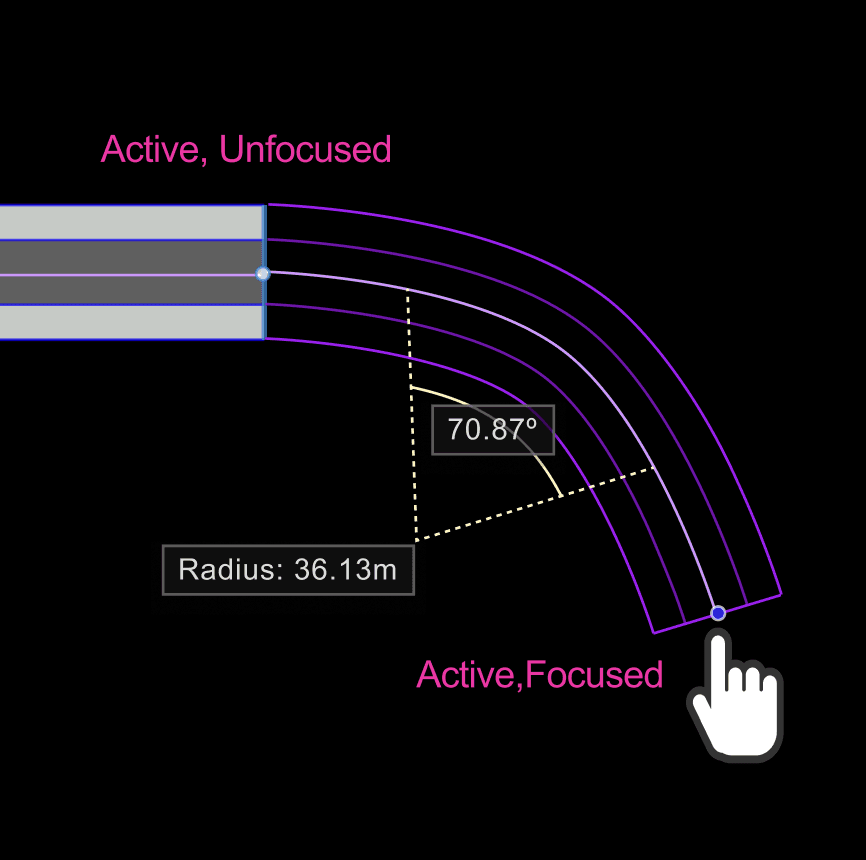
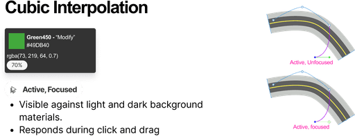
I differentiated the canvas controls by varying shape, size and color, making sure to establish recognizable patterns for consistency across the product ecosystem.
Visibility against all backgrounds
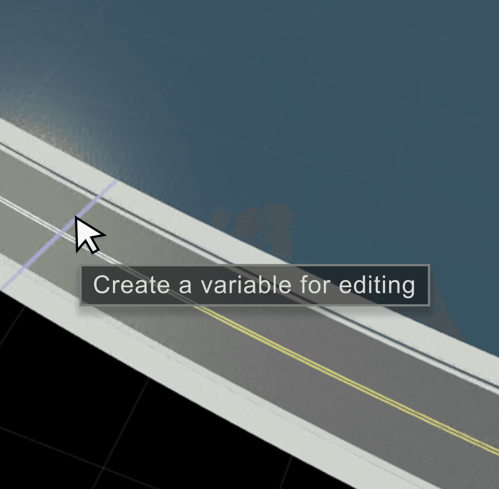
I implemented annotations and tooltips with transparent dark backgrounds to ensure readability against any surface.
See overlapping points clearly
Users typically hover over points to inspect them for selection. Closest overlapping points are shown in a different color and size than the active point.
Differentiating Active and Disabled States
Shape: Unique forms for each control, allowing for faster recognition.
Size: To emphasize visual hierarchy and provide feedback.
Opacity: Higher opacity pulls important points forward, making them stand out from the background. Lower opacity allows less relevant points to recede, reducing visual clutter.
Static vs. Dynamic
Dotted lines are used to denote labels and indicators to provide users with clear visual cues about which elements are informational vs. actionable.
This is the largest project I've taken on terms of complexity and impact.
I learned to involve experts early and share challenges openly. This approach prevented bottlenecks and fostered a supportive team environment.
Less documentation, more co-creation
Instead of working solo to create lengthy documentation, I co-wrote design documentation with developers prioritizing the information they would need to reference in their work.
This collaborative approach reduced the effort to understand and implement the designs.
Choose the right prototype fidelity
My experience partnering with developers to create a sandbox environment highlighted the value of cross-functional collaboration and thinking outside the traditional design tool box.
It bridged the gap between design and development early in the process, and we not only saved development time but also created a more accurate solution.


